
A business can have a strong logo and an attractive colour palette, but that does not automatically create a consistent brand identity. Customers may encounter a company through a business card, brochure, letterhead, packaging or promotional item, and each of these materials contributes to how the brand is perceived.
When the same visual elements and messaging appear consistently across different materials, a business becomes easier to recognise. On the other hand, inconsistent logos, colours, fonts or layouts can make printed materials feel disconnected.
A simple set of brand guidelines can help prevent these problems. By defining how a brand should appear before materials are designed and printed, businesses can create a more recognisable and professional presence across their printed communications.
What Is Brand Identity?
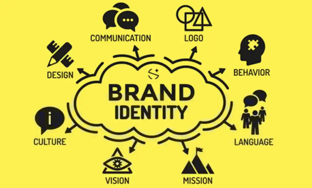
Brand identity is the collection of visual and verbal elements a business uses to present itself to customers. It includes much more than a logo. The colours, typography, imagery, graphic elements and tone of communication all contribute to how a brand looks and feels.
Common elements of a brand identity include:
- Logo: The primary visual mark used to identify the business.
- Colours: A defined palette that creates visual recognition.
- Typography: The fonts and text styles used across communications.
- Imagery: Photography, illustrations and other visual content.
- Graphic elements: Patterns, shapes, icons and other supporting design features.
- Brand messaging: The language, tone and key messages associated with the business.
Brand identity is what a business establishes to represent itself, while brand consistency refers to applying those elements similarly and recognizably across different touchpoints.
For printed materials, this distinction is particularly important. A business may have well-defined branding, but if every brochure, business card and stationery item uses different design choices, the overall identity can become difficult to recognise.
Why Is Brand Consistency Important?
Brand consistency helps customers become familiar with a business over time. When people repeatedly see the same logo, colours, typography and visual style, those elements can become associated with the company.
Consistent branding can also create a more professional appearance. A business whose printed materials share a clear visual language is more likely to appear organised and established than one whose materials look unrelated.
There are several practical benefits to maintaining consistency:
- Recognition: Customers can identify the business more easily.
- Familiarity: Repeated visual elements make the brand more memorable.
- Professional presentation: Coordinated materials can create a more polished impression.
- Clear communication: Consistent layouts and typography can make information easier to follow.
- Stronger brand presence: Different marketing materials work together rather than appearing as separate designs.
Consistency does not mean every printed item needs to look identical. Instead, the materials should share enough core elements to make their connection to the same brand clear.
Start With Clear Brand Guidelines
Brand guidelines provide a reference for anyone involved in designing, approving or producing branded materials. Even a small business can benefit from a simple document that explains how its identity should be used.
A basic brand guide may include:
- Approved logo versions
- Minimum logo spacing
- Primary and secondary brand colours
- Colour specifications for print and digital use
- Approved fonts
- Typography hierarchy
- Photography and imagery style
- Graphic elements and patterns
- Brand tone and messaging
- Examples of correct and incorrect usage
These guidelines do not need to be complicated. Their purpose is to reduce uncertainty and make design decisions more consistent.
They are particularly useful when different designers, marketing teams or printing providers work on a company’s materials. Instead of relying on individual interpretation, everyone can refer to the same standards.
7 Ways to Keep Brand Identity Consistent
Maintaining consistency becomes easier when the same basic principles are applied to every printed piece.
1. Use the Same Logo Correctly
The logo is often the most recognisable part of a brand identity, so it should be handled carefully.
Businesses should use approved versions of their logo rather than allowing different versions to appear on different materials. The logo should not be stretched, compressed, rotated or recoloured without a specific reason outlined in the brand guidelines.
Adequate space should also be maintained around the logo. When other text or graphic elements are placed too close to it, the logo can lose visual impact.
If a business has different logo variations for specific applications, those versions should be clearly defined in the brand guide.
2. Keep Brand Colours Consistent
Colours play an important role in visual recognition. A defined colour palette helps printed materials maintain a connection to the wider brand.
However, colours can appear differently depending on the printing process, paper, finish and other production factors. A colour that looks one way on a computer screen may not appear exactly the same when printed. For this reason, businesses should establish appropriate colour specifications for their printed materials and provide accurate artwork to the printer.
Using the same colour standards across business cards, brochures, packaging and other materials can help maintain a more unified appearance.

3. Choose Consistent Typography
Typography affects both the appearance and readability of printed communication.
A brand should have a defined font system rather than using a different typeface for every design. This can include a font for headings, another for body text and rules for elements such as captions or supporting information.
The same typography principles can then be applied across brochures, stationery, business cards and promotional materials.
Consistency does not require every piece of text to look exactly the same. Font size, weight and spacing can change according to the material, while the underlying typography system remains recognisable.

4. Maintain a Recognisable Visual Style
Logos and colours are only part of a visual identity. The overall style of photography, illustrations, icons, patterns and graphic elements can also contribute to recognition.
For example, a business may use clean photography, simple icons and a particular style of graphic shapes throughout its marketing materials. Repeating these visual characteristics can make different printed pieces feel connected.
The aim is not to fill every design with the same elements. Instead, visual choices should support the same overall personality and appearance.
5. Keep Brand Messaging Aligned
A consistent brand identity also depends on words.
Printed materials should use a similar tone and communicate accurate information about the business. A formal corporate brochure, for example, may not feel connected to a business card using overly casual language if both are intended to represent the same company.
Important details such as phone numbers, email addresses, website information, service descriptions and company names should also be checked before printing.
Keeping messaging aligned helps ensure that a business presents a consistent personality as well as a consistent visual identity.
6. Apply the Same Design Principles Across Materials
Different printed materials have different purposes and dimensions, but they can still follow the same design principles.
Spacing, alignment, hierarchy and positioning should be considered across the brand’s materials. For example, headings may consistently use a particular font weight, while contact information follows a familiar layout style.
A business card does not need to have the same layout as a brochure. Instead, both can use the same underlying design system.
This approach creates flexibility without losing visual consistency.
7. Check the Final Artwork Before Printing
A final artwork review can prevent small errors from becoming expensive printing problems.
Before sending a design for production, check:
- Spelling and grammar
- Contact information
- Logo placement
- Brand colours
- Image quality
- Font consistency
- Dimensions
- Bleed and safe areas
- Required finishing details
It is also useful to review a proof before approving a large print run. A final check can identify issues that may not have been noticed during the design process.
Applying Brand Identity to Different Print Materials
Brand identity becomes particularly noticeable when a business uses several types of printed materials. Each item has a different purpose, but the core identity should remain recognisable.
Business Cards
Business cards often provide one of the first physical impressions of a business. The logo, brand colours, typography and contact information should work together without making the card difficult to read.
A simple, well-organised design can make important details easy to find while maintaining the company’s visual identity.
Brochures and Flyers
Brochures and flyers usually contain more information than business cards, so they require stronger visual hierarchy.
Headings, images, colours and supporting graphics should follow the brand’s established style. Consistent design choices can also help customers recognise that different brochures or flyers belong to the same business.

Letterheads and Business Stationery
Letterheads, envelopes, folders and other stationery can reinforce a company’s professional identity during everyday business communication.
The logo, colours, typography and contact information should be positioned consistently while leaving enough space for the actual business correspondence.
Packaging
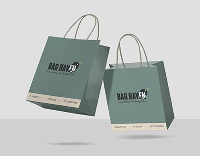
Packaging gives businesses another opportunity to carry their visual identity into the physical customer experience.
Brand colours, typography, logos, patterns and other design elements can be applied to boxes, bags, labels and other packaging formats. The design should remain recognisable while also considering the size, shape and printing requirements of the packaging.
Corporate Gifts and Promotional Materials
Corporate gifts and promotional materials can extend brand identity beyond traditional stationery.
Items such as notebooks, pens, folders, bags, mugs and other branded products can incorporate the same logo, colours and visual elements used across a company’s other materials.
The goal is not necessarily to place the logo as large as possible on every item. A thoughtful application of the brand can make promotional products feel more connected to the company’s overall identity.
Does Print Quality Affect Brand Identity?
Yes. The quality of printed materials can influence how a brand is perceived.
A well-designed piece can lose some of its impact if colours are poorly reproduced, images appear blurry or cutting and alignment are inconsistent. Similarly, paper quality and finishing can affect how a printed item feels and looks.
Several production factors can influence the final result:
- Paper quality: Different paper stocks create different textures and appearances.
- Colour reproduction: Accurate colour production helps maintain visual consistency.
- Finishing: Options such as lamination, embossing or other finishes can affect presentation.
- Image quality: High-resolution artwork generally produces clearer printed images.
- Cutting and alignment: Accurate finishing helps maintain a clean appearance.
- Overall presentation: The combination of design and production contributes to the final impression.
This is why brand identity should be considered throughout the design and printing process rather than only during the initial design stage.
A Simple Brand Identity Checklist Before Printing
Before approving any branded print material, businesses can use a simple checklist:
- Check the logo: Is the approved version being used correctly?
- Review the colours: Do they match the established brand palette?
- Check typography: Are the approved fonts and hierarchy being followed?
- Review imagery: Are images and graphics consistent with the brand style?
- Check the layout: Are spacing, alignment and hierarchy clear?
- Verify information: Are contact details and other business information accurate?
- Review production requirements: Are dimensions, bleed, resolution and finishing details correct?
- Approve the final proof: Has the complete artwork been reviewed before production?
A checklist like this can make the final approval process more reliable, especially when a business produces several types of materials.
Frequently Asked Questions
What is brand identity?
Brand identity is the collection of visual and verbal elements a business uses to represent itself. It can include the logo, colours, typography, imagery, graphic elements and brand messaging.
Why is brand consistency important?
Brand consistency helps customers recognise a business and creates a more familiar and professional appearance across different marketing and communication materials.
What should a brand guideline include?
A basic brand guideline can include logo rules, colour specifications, typography, imagery, graphic elements, messaging and examples of correct and incorrect usage.
How can businesses maintain consistent branding across printed materials?
Businesses can maintain consistency by using clear brand guidelines, approved artwork, defined colours and fonts, consistent design principles and a final review process before printing.
Should all printed marketing materials use the same design?
Not necessarily. Different materials have different purposes and formats, so their layouts can vary. However, they should share key brand elements such as the logo, colours, typography and overall visual style.
Conclusion
A consistent brand identity does not require every printed material to look identical. The goal is to create a recognisable connection between different business cards, brochures, stationery, packaging and promotional materials.
Clear brand guidelines provide the foundation for that consistency. From using the correct logo and colours to maintaining typography, messaging and design principles, small decisions can make different materials feel like part of the same brand.
A final artwork review and attention to print quality can further strengthen the result. When design and production are considered together, printed materials can support a business’s identity and create a more consistent experience for customers.