
A product label is often one of the first things customers notice when looking at a product. Whether it appears on a bottle, jar, box, or retail package, the label helps people recognise the product and understand what it offers. It also communicates important information and contributes to the overall appearance of the packaging.
However, an effective label needs more than attractive colours or decorative graphics. Its design should make information easy to read, reflect the brand’s identity, and suit the product it represents. A label that looks appealing but hides important details or uses an unsuitable layout may not serve its purpose.
This is why product label design requires a balance between visual appeal and practical use. Businesses need to consider the product, target audience, packaging material, label size, and printing requirements before finalising a design.
Why Product Label Design Matters
Product labels do more than display a brand name. They help customers understand what they are purchasing and give businesses an opportunity to present their products professionally.
A clear label makes important information easier to find. Depending on the product and applicable regulations, this may include the product name, ingredients, quantity, instructions, manufacturing details, warnings, or other required information. When these details are organised properly, customers can understand the product without struggling to read the packaging.Labels also contribute to brand recognition. Consistent colours, typography, logos, and visual elements help customers identify products from the same business. This is particularly useful for companies offering several products within one range.Another important benefit is product differentiation. When similar products are displayed together, their packaging and labels can influence which ones customers notice first. A distinctive design can help a product stand out while still communicating its purpose clearly.
For businesses, investing in professional product label design can therefore improve both presentation and communication. The goal is not simply to make a label attractive but to make it useful, recognisable, and appropriate for the product.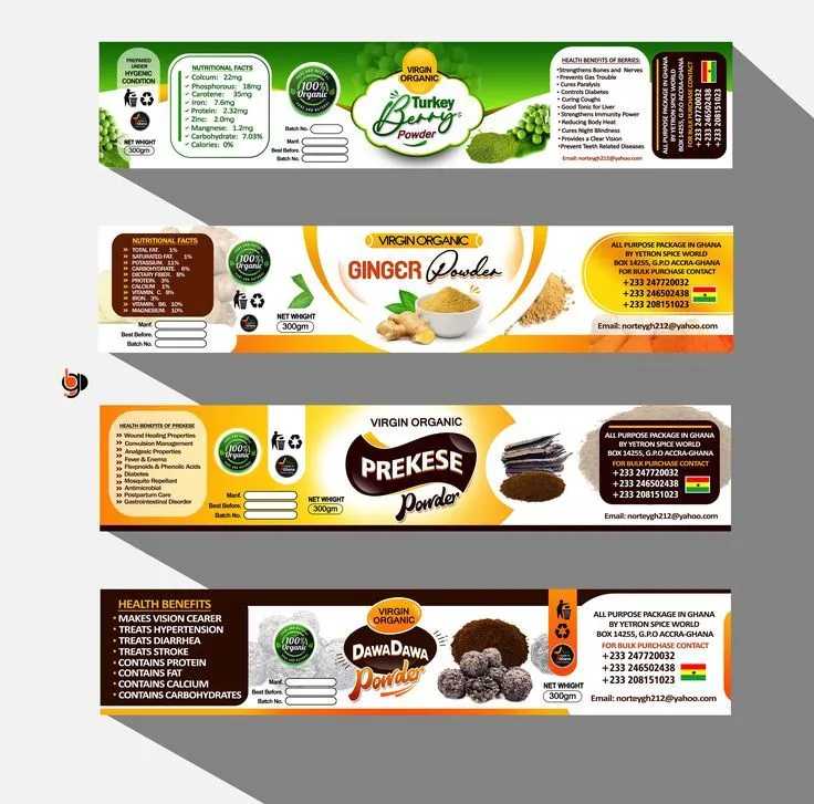
Essential Elements of an Effective Product Label
A successful label brings several design elements together. Each one should contribute to a layout that looks organised and communicates information clearly.
A Clear Product Name and Brand Identity
The product name should be easy to identify at first glance. It usually needs a prominent position on the label, with enough space around it to remain noticeable.
The brand logo should also be placed carefully. It should be visible without competing with the product name or other important information. Consistent use of brand colours, fonts, and design elements helps maintain brand identity across different products.
Readable Typography
Typography affects how easily customers can understand a label. Decorative fonts may look interesting, but they are not always suitable for product information.
Use a clear typeface for details such as ingredients, instructions, and product descriptions. Headings can use a different font or weight to create visual hierarchy, but the overall design should remain consistent.
Text size also matters. Important information should be readable at the actual size of the packaging, not just when the design is viewed on a computer screen.
Relevant Images and Graphics
Images, illustrations, and graphic elements can help communicate the nature of a product. For example, a food label may use relevant ingredient illustrations, while a skincare product may use a simpler visual style.
However, graphics should support the message rather than overcrowd the layout. Too many decorative elements can make the label difficult to read and distract attention from essential information.
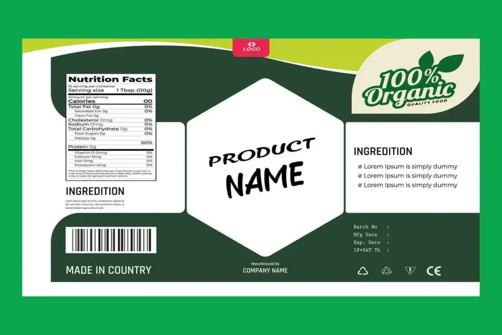
Important Product Information
A label should include the information customers need to understand the product. The exact requirements depend on the product category and the regulations of the market where it will be sold.
Before finalising the design, businesses should check that all required details are accurate, complete, and presented clearly. This is especially important for food, cosmetics, and other regulated products.
Choosing Colours, Fonts, and Graphics
The visual style of a label should reflect the product’s identity and appeal to its intended audience. Colours, typography, and graphics work together to create this impression.
Selecting Suitable Colours
Colours can influence how people perceive a product. Different combinations may create impressions of freshness, simplicity, energy, luxury, or playfulness.
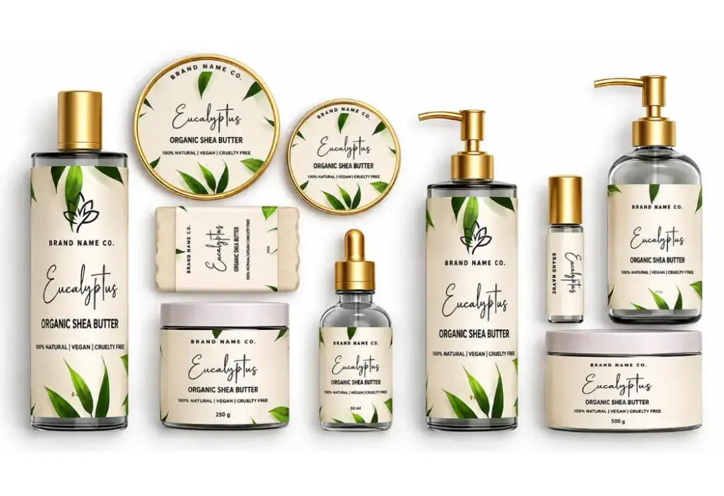
For example, a natural skincare range may use soft neutral or earthy shades, while a colourful snack product may use brighter tones. These are design choices rather than fixed rules, so the selected palette should suit the brand and audience.
Businesses should also maintain consistency across their product range. Using the same core colours with small variations can help distinguish individual products while keeping them visually connected.
Choosing Appropriate Fonts
A good font combination should be attractive and readable. One typeface can be used for headings and another for supporting information, provided they work well together.
Avoid using too many different fonts on a single label. A crowded typography style can make the design appear inconsistent and reduce readability.
Using Graphics Carefully
Graphics should have a clear purpose. They may represent an ingredient, explain a product feature, or simply add visual character to the packaging.
Use high-quality images and illustrations that remain clear when printed at the intended size. Before approving the design, check that graphic elements do not interfere with text or important product details.
Selecting the Right Label Size and Material
The label should be designed according to the shape, size, and surface of the packaging. A layout that works on a flat cardboard box may not work in the same way on a curved bottle or small jar.
Start by measuring the available label area. Consider the packaging’s shape and any curves, edges, or surfaces that may affect how the label sits. The design should fit comfortably without important text or graphics being placed too close to the edges.
Material selection is equally important. Common options include:
- Paper labels: Suitable for many dry products and general packaging applications.
- Gloss labels: Provide a shiny appearance and can make colours look more vibrant.
- Matte labels: Offer a smooth, non-glossy finish for a more understated look.
- Transparent labels: Allow parts of the packaging to remain visible and can create a minimal appearance.
- Water-resistant labels: Useful for products that may come into contact with moisture, depending on the material and adhesive specifications.
The right choice depends on how the product will be stored, handled, displayed, and used. Businesses should discuss material and adhesive requirements with their printing provider before placing a large order.
How to Maintain Brand Consistency Across Product Labels
When a business offers several products, their labels should feel like part of the same brand family. Consistency makes it easier for customers to recognise products and understand their relationship.
Begin by establishing a basic label style. This may include a defined colour palette, logo placement, typography, image style, and layout structure. These elements should remain consistent across the product range.
At the same time, each product needs enough visual distinction to avoid confusion. Businesses can use different accent colours, product names, illustrations, or small layout variations to identify different flavours, sizes, or product categories.
For example, a company selling several varieties of a food product may use the same label layout for every item while changing the accent colour and product name. This keeps the range coordinated without making every label look identical.
Frequently Asked Questions
What makes a good product label design?
A good product label design combines readable typography, suitable colours, clear product information, and consistent branding. It should also fit the packaging properly and suit the product’s intended audience.
What information should be included on a product label?
Depending on the product and applicable regulations, a label may include the product name, brand, ingredients, net quantity, usage instructions, warnings, and manufacturing or contact details. Businesses should verify the requirements for their product category and target market.
Which material is best for product labels?
The best material depends on the product’s packaging and usage conditions. Paper, gloss, matte, transparent, and water-resistant materials are common options. Consider moisture exposure, handling, storage, and adhesive performance before choosing.
Why is label consistency important for a brand?
Consistent labels help customers recognise products from the same business. Using coordinated colours, typography, logos, and layouts creates a more organised product range and strengthens brand identity.
Conclusion
Product label design plays an important role in how a product is presented and understood. A well-planned label communicates essential information, supports brand recognition, and helps create a professional appearance on the shelf.
Businesses should consider more than colours and graphics when developing labels. Typography, layout, material, packaging dimensions, and printing requirements all contribute to the final result.
By keeping the design clear, maintaining brand consistency, and checking artwork before production, businesses can create labels that look appealing and serve their practical purpose. With the right planning and professional design support, a product label can become a valuable part of the overall brand experience.