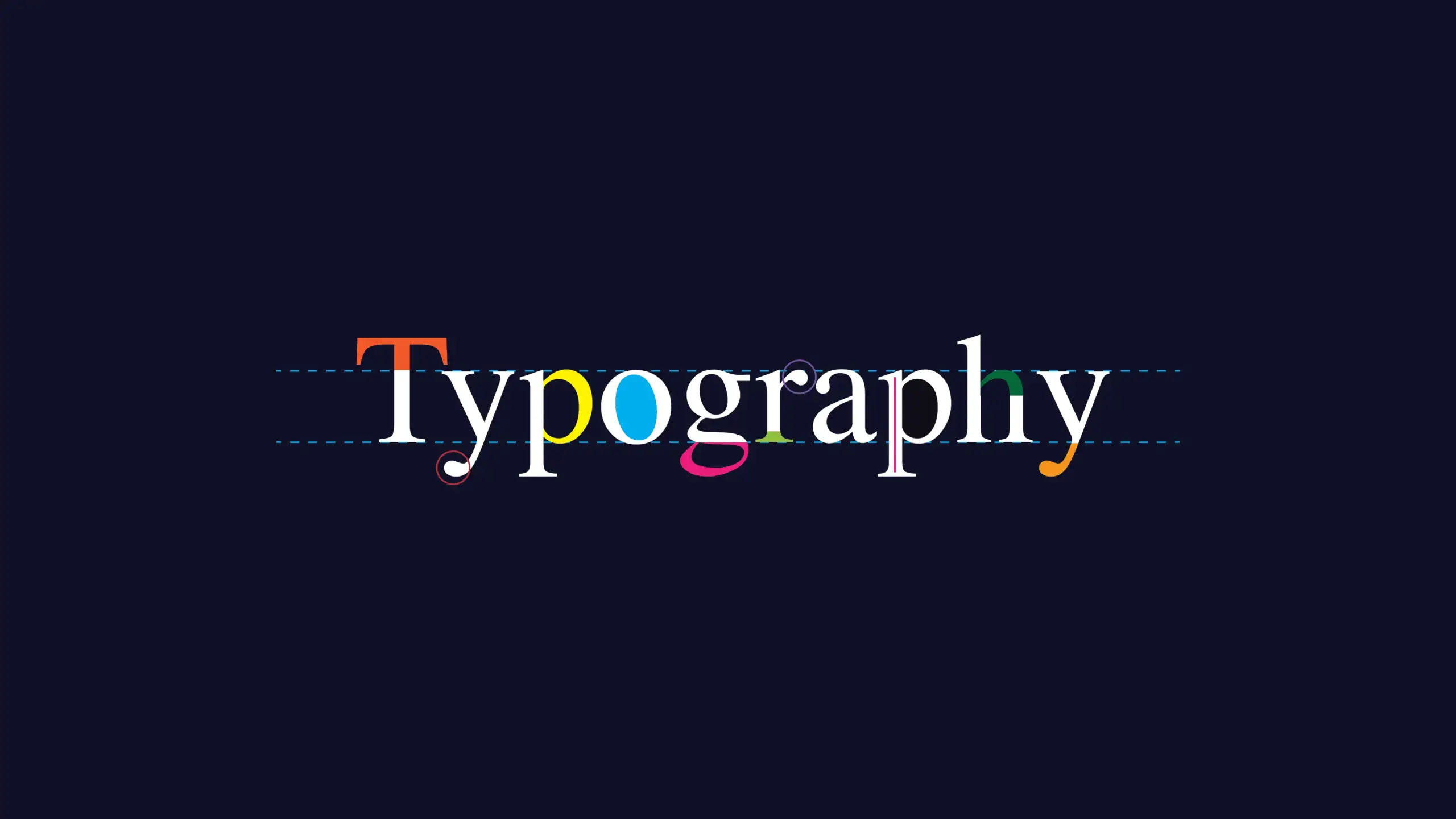
Typography is the basis of design; hence, with the right typography tricks, one can add a great amount of beauty and efficiency to work. This is not about picking a font but rather understanding how text can be used in order to create balance, guide the eye, and provide the necessary message to the reader. Here, we’ll discuss the essential ten typography tricks every designer should know to take their designs to the next level.
1. Typography Tricks for Effective Font Pairing
Mastering the art of pairing fonts is one of the most critical typography tricks. Contrasting a serif font with a sans-serif font provides an almost-accepted combination in order to achieve a mixture of contrast combined with harmony. This can lead to a clearer visual hierarchy to make your design more professional and easier to navigate.
2. Kerning: A Key Typography Trick
Kerning refers to the space between individual letters. It is another major typography trick that helps you make your design better. Appropriately kerned text will be aligned and easy to read, even if the text is large in a display or logo. It’s one of those little details that will make your design work shine.
3. Use Typography Tricks to Establish a Strong Hierarchy
Create a clear typographic hierarchy using different font sizes, styles, and weights to create a visual guide for the reader. Headlines must be readable, subheadings should clarify, and the body text has to be readable and consistent.

4. Optimize Leading for Readability
It pays attention to the readability of your copy, and you can adjust the line spacing. One simple typographic trick is to adjust the leading, or line spacing, to make the text read easily. On web and print designs, optimal readability can be achieved by setting line-height at about 120-150% of the font size.
5. Significant Typography Trick: Text Alignment Matters
Also, the alignment of your text can make all the difference. This will make left-aligned text easy to read; however, center or justified text may be able to produce more formal or symmetrical looks. Being conscious of alignment can be a simple but effective typography trick that enhances both readability and balance.
6. Use Only Limited Fonts
Too many fonts can clutter your design and confuse your audience. One typography trick that you should be aware of is to limit yourself to two or three fonts in a single project. That helps with creating consistency and enhances visual flow as well.
7. Play with Font Weights for Visual Contrast
Using varied weights of light, regular, and bold typography tricks within the same font is an effective way to add emphasis or contrast without having to switch between fonts. For example, one can use bold fonts for a headline, whereas lighter fonts could be suitable for secondary information or even subtle text elements.
8. White Space Management
White space, or negative space, is a mighty typography trick that lets your design breathe. It stops your text from appearing crowded and forces the viewer to pay attention even more to those key pieces. White space is embracing a cleaner and more sophisticated design.
9. Utilize Color to Enhance Typography
Colors can make certain areas of text stand out, bringing your design out from the background. One trick in using typography is using a key title or call to action in a color that really pops but using a neutral color for all of the rest of the text. This way, you’re drawing attention to the points you wish to focus on without overwhelming the reader.
10. Responsive Typography
Today, the design aspect is crucial for both the web and mobile screens. A very important typography trick is that your text should be scalable on every device. Use responsive fonts and also work on line lengths so that the content is readable everywhere, irrespective of screen size.
Conclusion
Learning these typography tricks is the ace most designers need to work with designs that are not only aesthetically appealing but also functional. From pairing fonts to optimizing text according to different screen sizes, here’s how you can read better, make visual hierarchies more effective, and really have a much better user experience with your work. Ingrain these tricks into your next design project, and watch your work reach new heights.
1 Comments
I like this weblog very much, Its a real nice spot to read and
receive info.Raise your business